Annual membership or season pass design case studies
InBlog
annual, member, season pass, subscriber
5 min read
To showcase how meaningful design tips and tricks are when thinking about your annual membership or season pass product, pricing and promotion, we look at different elements from case studies across the visitor attractions sector.
Auckland Zoo has made sure its site links for sponsored search results include a clear call to action across tickets and memberships (then visit information, add ons and what’s on). It would be even better if organic results were also optimized for this. Curiously, although a member can login as an obvious call to action from the home page, a similar “join” button is missing and would be beneficial next to the “tickets” button (instead, it’s tucked into the “visit” menu).
MoMA, art museum, New York City Pricing user experience design
MoMA is a masterclass in user experience design. The membership versus tickets call to action is stunningly clear from its website home page – helpfully, the membership menu drops down into ‘Become a member’ or ‘Login’, and you’re also offered another opportunity to login on the join page.
The pricing page itself is clearly structured with a clever nod to best practice user experience design for pricing, which suggests three options in increasing price band option, the middle being the preferred promotion (even if the lowest is most common). This could be further accentuated with emphasis like a ‘Popular’ badge or heavier border – an effect more subtly conveyed through color choices of the brighter middle pink block versus the paler lime and peach.
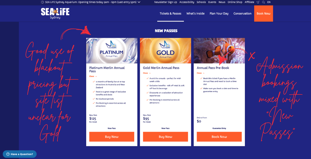
SeaLife (Merlin), aquarium, Sydney Use of multi site benefits and block out times
Merlin benefits from cluster power with multiple attractions in the same city in the case of Sydney and also uses block out pricing as a price structure to preserve capacity on busy days. Pricing is tricky to orient to as it starts high rather than low when reading left to right and is mixed with ‘pre-book’ under the ‘new passes’ section. It’s also not clear whether the Gold includes single or multiple site.
Six Flags Over Texas, theme park, Texas Subscription payments and block out times
Six Flags also use some blockout times in more cost effective membership options. An upfront $20 fee on the first month helps balance a lower monthly advertised price with revenue surety against new members using it to dip below the initial visit cost ($29) and then reneging on the payment.
Six Flags offers a combination of monthly memberships and annual season passes, with easy navigation and comparison between the two in a pricing design which references best practices, although slightly dated in the credit card design styling. The user experience to unfurl or collapse an extended compare list of benefits (including clarifying exclusions) is helpful.
Natural History Museum does a great job of clearly stating its membership proposition and benefits, which are common to all member types. It’s always challenging to formulate the value proposition of a membership in an otherwise free admission attraction, so this is especially important.
The museum offers discounts depending on payment type, plus a gift option.
SeaWorld Orlando, amusement park, Orlando Estimated savings and value
Locals in Orlando are spoilt for choice for their season pass options and a never ending list of attractions to try. SeaWorld clearly articulates the savings and value of their passes by calculating this for the visitor, although prices are somewhat buried. They also use blackout dates, autorenewal, benefits like a member lounge and multiple attraction offers – a great example of many design practices. To make comparison simpler for the member, options are laid out in a pricing table. You can see at the time of capture there is a 20% off sale offer.
Canada clearly separates those looking at a single park pass versus multiple parks in a way which is easy to understand, although promoting the option to buy a pass in person may dilute conversions of passes purchased online. Benefits are well articulated “pays for itself in as little as seven days”, although could be elevated on the page. Unusually, the Parks are still sticking to a posted membership card to then be presented onsite, which creates friction for those wanting to visit immediately.