The new year has brought some exciting new changes to Dexibit’s app. Here’s a look at some of the user interface changes we’ve made with Dexibit’s Design Director, Daniel Jordan.
Recently Dexibit has launched some new changes to our application. Our login page (the screen you see when you first enter the application) has been updated, as well as a number pages you use to administrate your account, such as when you want to invite a new user. We’ve also updated our navigation menu – the area on the left hand side that gives you access to the different modules.
These changes bring many small user experience improvements that I hope you’ll enjoy, and also represent a big step for the application in terms of the new potential we can unlock over the coming year.
With the new navigation and login experience, we’ve had the opportunity to update the colors, not just in the interface but more importantly in the data visualisations too. I wanted to take a moment to explain in a little more detail the choices we’ve made, as it’s been something of a passion project of mine!
Interface colors
Firstly, we’ve made some small changes to the neutral colors used within our app’s interface.
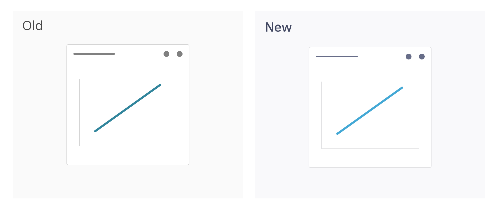
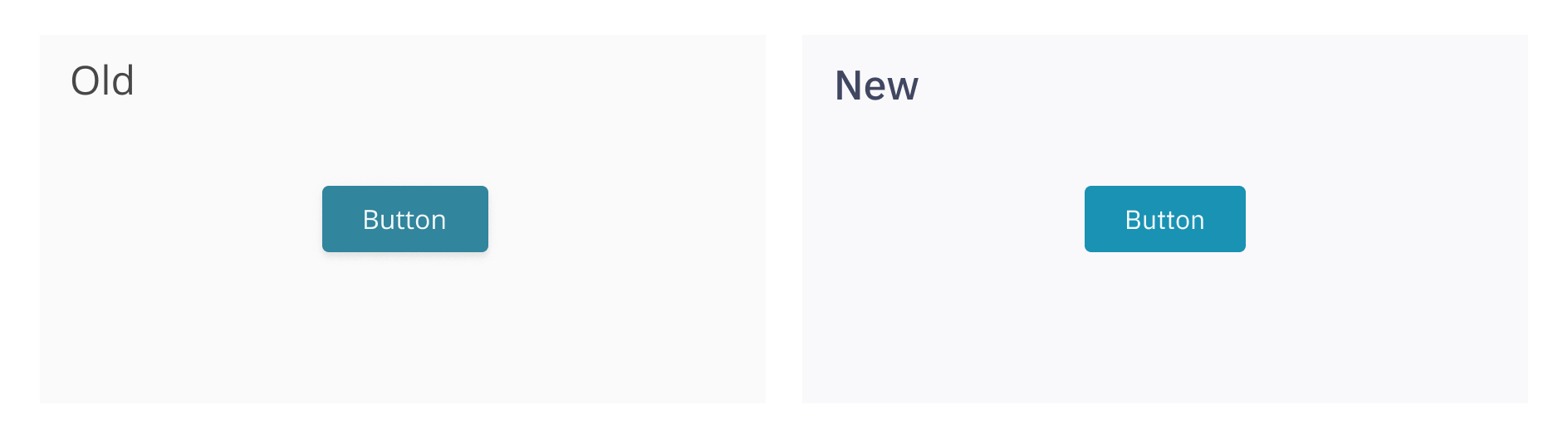
See how the colors on the right feel subtly fresher and more vibrant – this is due to the greys having a slight touch of blue, as opposed to the older interface which uses pure greys (i.e. mix of pure black and white).
In addition, we’ve subtly modified the primary color in the app too, updated to a more modern typeface and removed many of the shadows.
Behind the scenes we’ve implemented many improvements that allow us to easily introduce alternate themes, like dark or high contrast themes, later down the line.
The net result is a fresh, exciting and modern looking application.
Chart colors
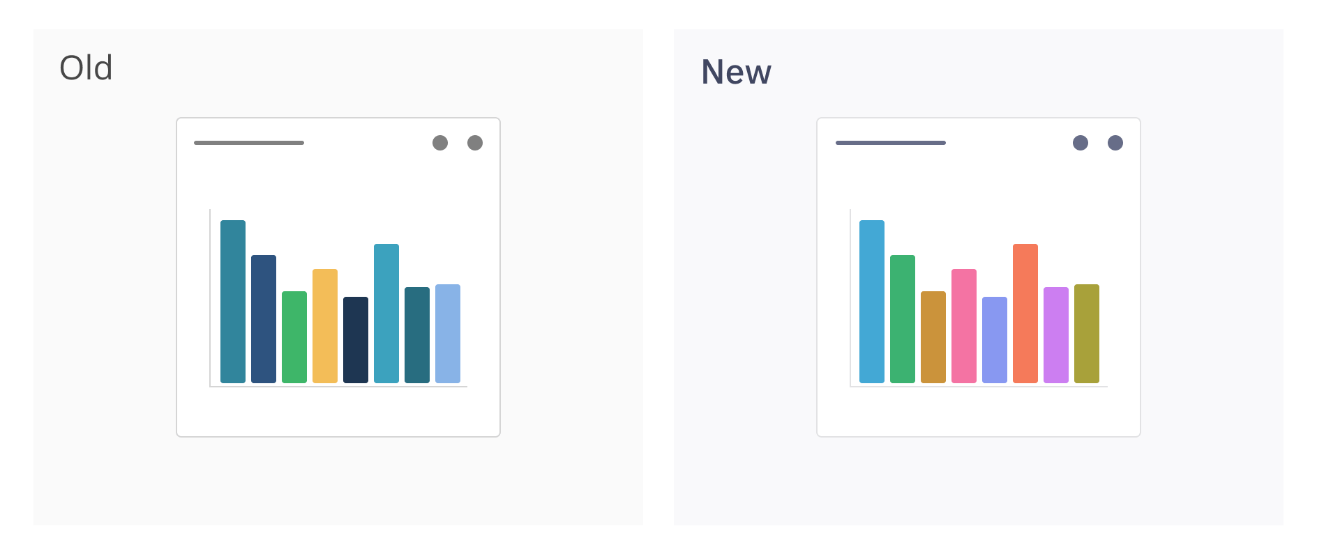
The data visualisation palette we’ve used for the last couple of years was designed around the wider application theme. It used teals, navys, yellows and blues. We’ve found the colors were not always easily discernible from each other. The darker colors, whilst distinct, might be misinterpreted as having more prominence than lighter colors. The lighter colors may not always have sufficient contrast.
I took a fair amount of time last year to create a new set of colors for our data visualisations, with the following goals:
- colors should match the branding of the application
- colors should be tasteful
- there should be enough colors to represent any number of series the user adds (within reason)
First I picked a key color, which is a version of our app’s main teal color. I then used the HSLuv colorspace to take our key color and rotate the hue so that we got a selection of evenly distributed colors with perceptual uniformity – i.e. no one color seems more prominent than any other
This gives us a categorical palette from which we can apply to our series. The colors are fresh and fit in with the surrounding interface, but more importantly are much more distinct.
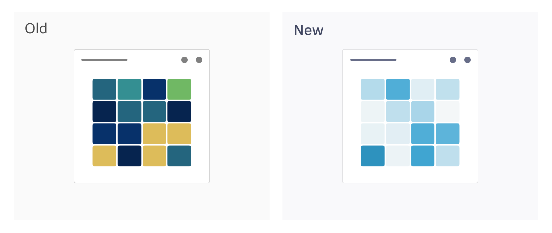
I also created a sequential palette, for use in heatmaps and choropleths. I used the tool ChromaJS to create a smooth gradient. This has vastly improved the heatmaps in our dashboards.
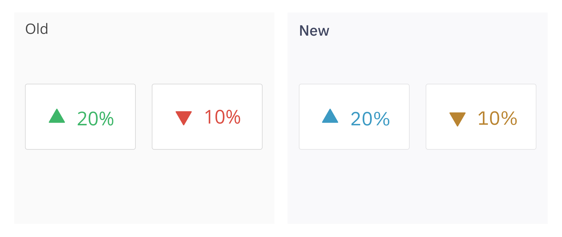
Positive numbers, such as goal achievement, are represented by the key color, and negative numbers are represented by its complementary color. This moves away from the red/green combination in the old theme for good reason – the new colors will work better for those with colorblindness.
I read widely about data visualisation color palettes in a number of books and blogs, and investigated a number of tools for creating colors programatically – an endlessly interesting topic! The palettes that I’ve chosen use many commonly stated best practices, and are designed to help the user understand the data being shown as easily as possible.
For each color palette I used the tool VizPalette to test them for two things:
- they were visually distinct (using d3-jnd to test)
- ensure the color names were distinct (a user could easily say to a colleague “compare the green to the blue” for example)
The tool also allowed me to test how charts would appear for users with visual impairments. The simpler palettes test well for all users of all abilities, but as the number of colors increases beyond 5 the harder it is to cater for users with visual impairments. This may be something to be aware of when designing dashboards for users within your visitor attraction.
In summary
In updating our interface, we hope we’ve created a fresh and vibrant app that is enjoyable to use, and data visualisations that tell clear, informative and enjoyable stories about your data.